

Overview
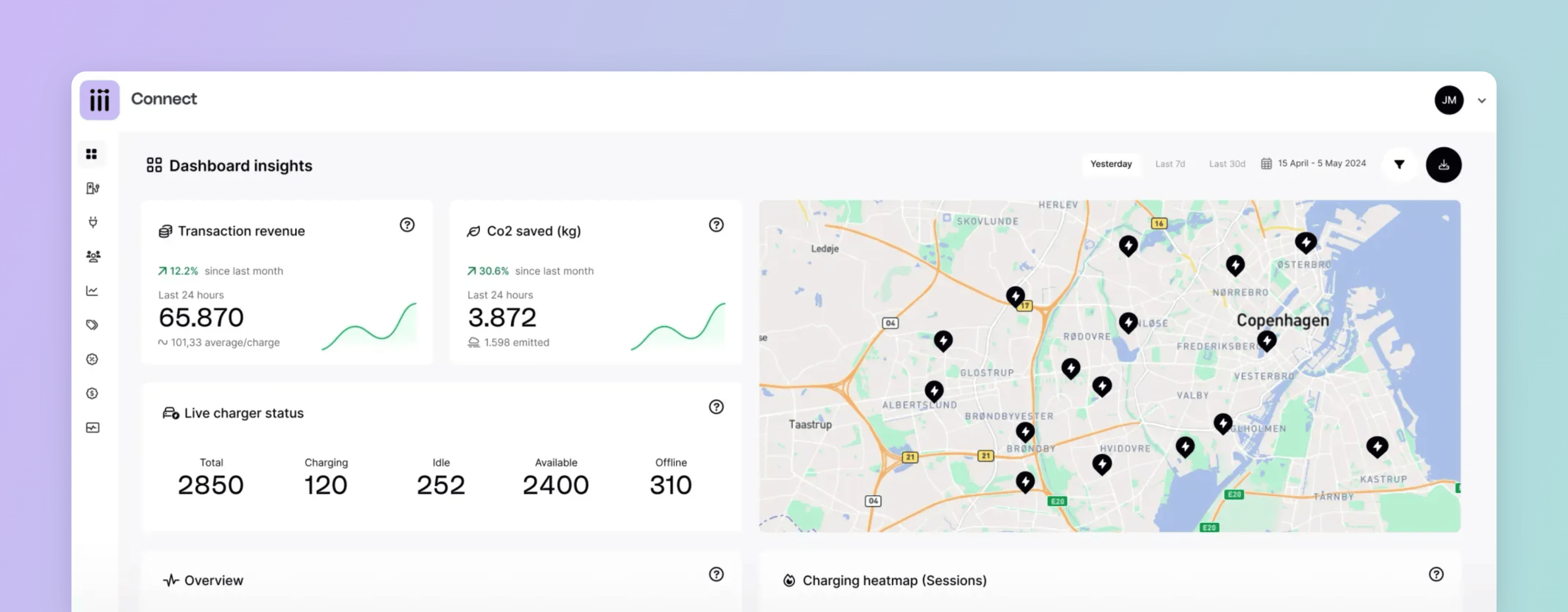
Every metric on the page answers a question you would otherwise export data to answer: how much did we charge, what did it earn, how busy were we, and was anything broken. The figures cover the chargers you operate, and three filters decide which of them are in scope. When you need to go below what the page shows, export it as a CSV — one row per connector per day, on whatever filters and time range you have set.Filters and time range
Three controls scope everything the page reports.Time range
Defaults to the last seven days. Yesterday, 30 days, and a custom range are also available.
Customer
Narrows the page to one customer’s locations, including those owned by its child customers.
Location
Narrows to a single location.
Live cards
Two cards ignore the time range, because they report the present rather than a period.Live charger status
Live charger status
Counts connectors, not charge boxes, split across offline, charging, available, and idle. A charge box with two connectors that drops offline therefore adds two to the offline count.
Map
Map
Plots every location in your network, including locations still pending.
Period metrics
Everything else on the page is calculated over the selected range. Each card is defined below, in the order it appears.Transaction Revenue
Transaction Revenue
The total value of all charging sessions in the period, excluding VAT.This is transaction value rather than revenue. It does not account for the commercial agreements you hold with Spirii or with your operator, so it will not match the figure on your invoice. Read it as what your chargers billed, before anything is settled.
CO₂
CO₂
An estimate of the emissions avoided by charging electrically instead of burning fuel, calculated from consumption:Estimated CO₂ saved (tonnes) = total kWh × 5.5 × 0.000150The two constants are the distance an average EV covers per kWh (5.5 km) and the emissions of a comparable combustion car (150 g/km, or 0.000150 tonnes/km). Both are published figures from the Danish Committee on Climate Change, 2018.The estimate is gross. It describes displaced fuel rather than a net carbon position, because it does not subtract the emissions of the electricity used to charge.That suits awareness, comparison, and stakeholder communication. For lifecycle carbon accounting or a Scope 1–3 audit, take your consumption data to a sustainability advisor.
Overview
Overview
One interactive graph carrying five figures for the period.
Active users counts authorisation charge keys, not people: the RFID card, app charge key, or free-vending tag the session was started with. One driver carrying two RFID cards therefore counts as two active users, and one fleet card shared by six drivers counts as one.Roaming drivers usually resolve to individual charge keys. Sessions with no individual identity behind them are grouped instead, because they all arrive carrying the same charge key value: everything authorised through a payment terminal counts as one user, and everything with no authentication counts as one user. A site taking five hundred contactless payments in a week therefore contributes one active user, not five hundred.A session only counts if it completed and delivered energy, and if it both started and ended inside the selected range. A session running from 23:40 on the last day of the range to 00:10 the next morning is counted in neither period.
Heatmap
Heatmap
Which days and hours of the week your chargers are busiest.A session is counted at the hour it ended, so one running from 09:00 to 13:00 lands in the 12–14 block rather than being spread across four.
Occupancy
Occupancy
The percentage of the period your network was either charging or idle.Idle covers the OCPP statuses that mean a vehicle is connected without drawing power:
Preparing, Finishing, SuspendedEV, and SuspendedEVSE.Most Used Locations
Most Used Locations
Your locations ranked by sessions, energy consumed, or occupancy rate.
Uptime
Uptime
The percentage of the period in which your EVSEs were not in a faulted state, measured as aggregate EVSE-hours across whatever your filters include.That definition has three consequences:
- An EVSE reporting
Unavailablecounts as up. OnlyFaultedcounts against uptime. - A charge box being offline does not enter the calculation.
- An EVSE that took no sessions at all counts as up for the whole period.
Dependencies & limitations
- Transaction value is not revenue. The figure is net of VAT and before the commercial agreements behind your invoice.
- Uptime measures fault-free EVSE time.
UnavailableEVSEs and offline charge boxes do not reduce it. - The CO₂ figure is a gross estimate. It is calculated from consumption and does not subtract the emissions of the electricity used.
- Active users counts authorisation charge keys, not people. One driver with two cards counts twice, a shared fleet card counts once, and payment terminal and unauthenticated sessions each collapse to a single user.
Related
To take these figures into a spreadsheet or a reporting tool of your own, use an export rather than the page itself.Exports
Getting CDR data and the Dashboard view out of Connect for your own analysis.
Sessions and CDRs
The records every period metric on this page is built from.
Live status tracking
Connector-by-connector detail behind the live charger status card.
Locations
What the customer and location filters narrow the page to.